
Introduction
This article series is designed to keep investors informed of upcoming dividend increases. For dividend growth investors, this can be an opportunity to start or add to positions prior to a new increased payout. This can be especially important for retirees who live on dividend checks.
The lists I’ve compiled provide various stats for the stocks that are increasing their dividends next week.
This list is a trimmed-down version only covering dividend increases. A full upcoming dividend calendar is always available here. If you know how this was built and the caveats, feel free to jump down to the lists themselves.
How It’s Assembled
The information presented below was created by combining the “U.S. Dividend Champions” spreadsheet hosted here with upcoming dividend information from Nasdaq. This meshes metrics about companies with dividend growth history with upcoming dividend payments (and whether those payments are increasing). These companies all have a minimum five-year dividend growth history.
As a point of clarification, companies are included that may not raise their dividend every calendar year, but the total annual dividend received will still be higher each year. One such example is Bank of America (BAC).
In the table here on SA, the annual dividend payout received by a shareholder increased for each year in this time frame. Thus, it is eligible for inclusion in the “CCC” list.
That said, it did pay out the same amount for eight quarters in a row, but again, the total annual amount increased each year.
United Technologies (UTX) is another example.
What Is the Ex-Dividend Date?
The “ex-dividend” date is the date you are no longer entitled to the dividend or distribution. You need to have made your purchase by the preceding business day. If the date is a Tuesday, you need to have purchased (or already owned) shares by market close on Monday. Be aware that for any stock going ex-dividend on a Monday (or Tuesday, if Monday is a holiday), you must own it by the prior Friday.
Dividend Streak Categories
Here are the definitions of the streak categories as I’ll be using them throughout the piece:
- King: 50+ years
- Champion/Aristocrat: 25+ years
- Contender: 10-24 years
- Challenger: 5+ years
Fun Facts
| Category | Count |
| King | 0 |
| Champion | 1 |
| Contender | 0 |
| Challenger | 1 |
The Main List
The data is sorted by the ex-dividend day (ascending) and then the streak (descending):
| Name | Ticker | Streak | Forward Yield | Ex-Div. Date | Increase Percent | Streak Category |
| West Pharmaceutical Services, Inc. | (WST) | 27 | 0.45 | 22-Oct-19 | 6.70% | Champion |
| Thor Industries, Inc. | (THO) | 9 | 2.79 | 24-Oct-19 | 2.56% | Challenger |
Field Definitions
Streak: This is years of dividend growth history sourced from the U.S. Dividend Champions spreadsheet.
Forward Yield: This is the new payout rate divided by the current share price.
Ex-Dividend Date: This is the date before which you need to own the stock.
Increase Percent: This is the amount by which the dividend is being increased.
Streak Category: This is the overall dividend history classification of the company.
Show Me the Money
Here’s a table mapping the new rates versus the old rates. It also reiterates the increase in percentage. This table is sorted the same way as the first table (ex-dividend day ascending, dividend streak descending).
| Ticker | Old Rate | New Rate | Increase Percent |
| WST | 0.15 | 0.16 | 6.70% |
| THO | 0.39 | 0.4 | 2.56% |
Additional Metrics
Here are some additional metrics related to these companies, including yearly pricing action and the P/E ratio. This table is sorted the same way as the table above. The value investor may find stock ideas with those companies near their 52-week lows. They may provide a larger margin of safety and inflated yield.
| Ticker | Current Price | 52-Week Low | 52-Week High | P/E Ratio | % Off Low | % Off High |
| WST | 142.37 | 91.75 | 152.1 | 46.74 | 55% Off Low | 6% Off High |
| THO | 57.4 | 42.05 | 85.53 | 22.87 | 36% Off Low | 33% Off High |
Tickers by Yield and Growth Rates
Some investors are more interested in current yield, so this table is sorted descending by yield. This also includes some of the historical dividend growth rates as a bonus. Additionally, the “Chowder Rule” has been included, which is the current yield + five-year dividend growth rate.
| Ticker | Yield | 1-Year DG | 3-Year DG | 5-Year DG | 10-Year DG | Chowder Rule |
| THO | 2.79 | 10.3 | 10.6 | 14.3 | 18.3 | 17.1 |
| WST | 0.45 | 7.5 | 8.2 | 8.2 | 7.2 | 8.7 |
Bonus
With only two companies this week, I’ll throw a quick highlight on each. The story couldn’t be different looking at these two companies. We’ll take a closer look at both THO and WST.
A picture is certainly worth a thousand words when looking at the F.A.S.T. Graph for Thor Industries. The maker of recreational vehicles saw tremendous earnings growth coming out of the recession until the massive pullback this year. The double whammy of lower earnings multiplied by a P/E cut in half has seen the stock decline 2/3rds in just under two years. With the stock at 10x earnings, there may be some opportunity here.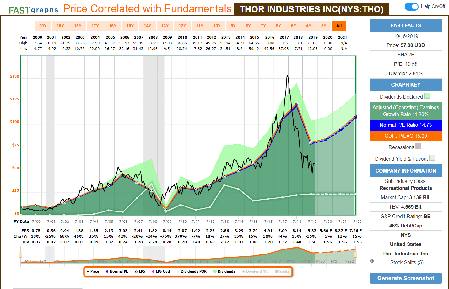
(Source: F.A.S.T. Graphs)
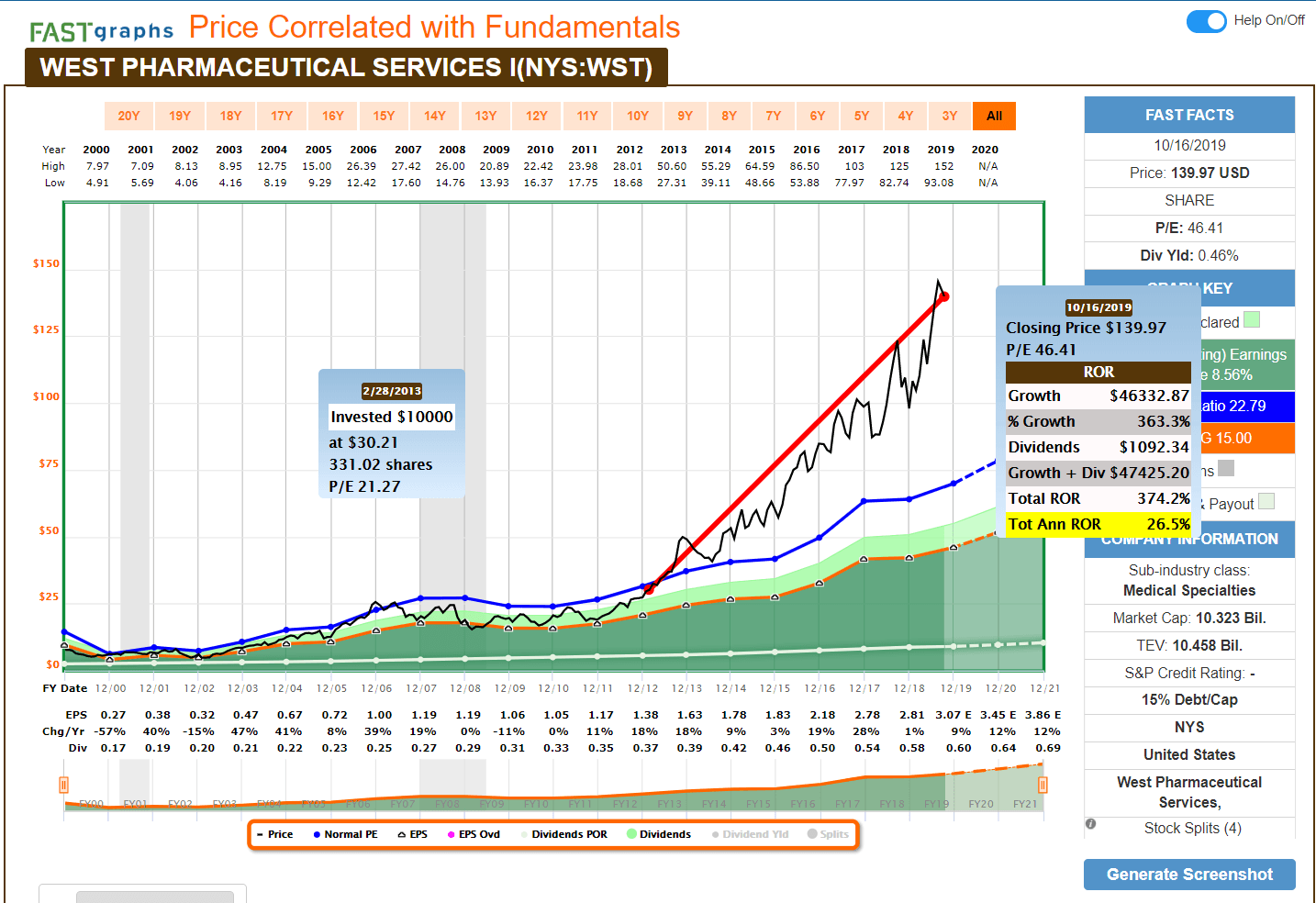
When we flip over to West Pharmaceutical, the multiple expansion is unmistakable. Steady earnings growth seen year after year out of the recession has granted WST an increasingly growing multiple. From 2012 onwards, the P/E rewarded has grown from about 20 to a current approximate 46x full-year estimate. That dynamic multiplied by strong earnings growth has led to these 26% annual returns. With a token amount of debt, the company doesn’t have a credit rating.
Looking at the scorecard from Simply Safe Dividends, here’s how they rank.
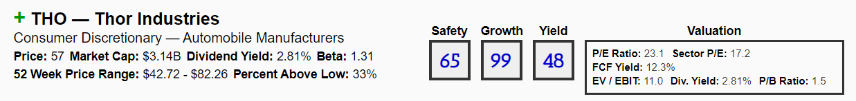
Thor scores well for dividend growth (this year was absolutely a divergence from the trend) and sports a middle-of-the-pack safety and yield score.
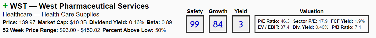
On the flip side, West Pharmaceutical scores incredibly well on dividend safety and growth. That comes at the expense of current yield, which is well below what is offered by even the S&P 500.
Stock Returns
I ran a stock return calculation comparing THO and WST to the S&P (SPY) since this time in 2010.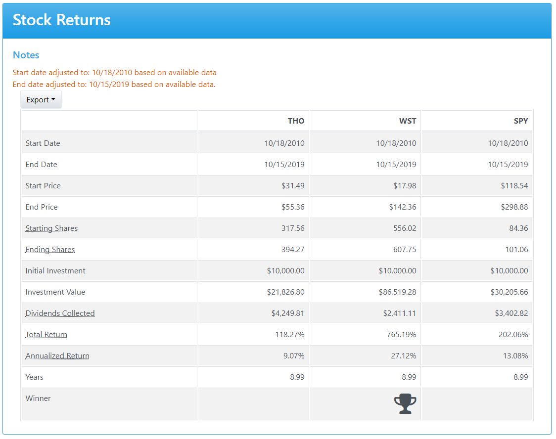
WST was the monster performer over the time frame, which was not surprising at all in hindsight. Thor lagged the S&P, but that can be at least well explained by the colossal stock price collapse in the past two years. THO did provide the most dividends though, so depending where an investor got in, the results may not have been bad.
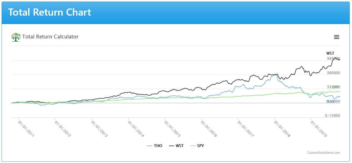
Here’s the look at the investments over time:
- THO is the blue line.
- WST is the black line.
- SPY is the green line.
WST was the strongest performer through the entire investment horizon. THO performed exceptionally well, and there was that brief blip in time near the end of 2017 where the results nearly matched those of WST. Obviously from that point, the stock was in free-fall, and it ultimately fell below the results of just the S&P.
(Courtesy: Custom Stock Alerts)
Conclusion
I hope you find this information valuable. Let me know if you want to see additional data points or what may help make this more useful.
As always, do your due diligence on any stock before buying or selling. Happy investing!
Disclosure: I/we have no positions in any stocks mentioned, and no plans to initiate any positions within the next 72 hours. I wrote this article myself, and it expresses my own opinions. I am not receiving compensation for it (other than from Seeking Alpha). I have no business relationship with any company whose stock is mentioned in this article.